The 3 Core Questions: How to Align Your Squarespace Homepage to Your 2026 Business Goals
 By Rachel Jerris
 Services
Most business goals fail quietly on the homepage. Not because the ideas are weak, but because the message is unclear. In 2026, attention is shorter, expectations are higher, and your homepage must work harder to earn trust fast. Aligning it with current priorities requires more than a redesign. This article breaks the homepage strategy down into three essential questions that bring focus and alignment back to your Squarespace site.
Who Are You Trying to Reach? Design Your Homepage Around Real People
Define Your Target Audience for 2026
Before adjusting layouts or rewriting headlines, you need clarity on who your homepage is actually for. In 2026, many businesses serve more than one audience, and your homepage must signal relevance within seconds. On Squarespace, this clarity guides every design and content decision. Customers, clients, and partners arrive with different expectations, and your homepage should help each group quickly confirm they are in the right place.
Common audience types include:
-
Customers who want fast answers, simple navigation, and clear paths to pricing or purchase
-
Clients seeking professional services, credibility, detailed offerings, and proof of expertise
-
Partners such as collaborators or investors who look for mission alignment, growth signals, and leadership clarity
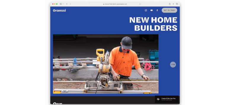
A tech startup in 2026, for example, may attract app users, enterprise clients, and investors at the same time. The homepage must balance these needs without overwhelming any one group. List your primary and secondary audiences before making any homepage changes.
Let Homepage Design Reflect Audience Priorities
Once your audience is defined, your homepage design should mirror what they care about most. Layout, visuals, and messaging work together to communicate relevance at a glance.
Design considerations by audience:
-
Layout: Product-focused for customers, structured and informative for clients, polished and strategic for partners
-
Visuals: Lifestyle imagery for customers, professional graphics for clients, clean and corporate visuals for partners
-
Messaging: Benefit-driven for customers, value and credibility-focused for clients, vision-led for partners
Think of your homepage as a mirror. When visitors see their needs reflected back to them, trust forms faster. Review your homepage and identify which audience it currently speaks to most clearly.
Practical Tips for Audience-Focused Homepage Design
Strong audience alignment shows up in small but intentional choices. Headlines should speak directly to visitor needs, not company ego. Imagery and testimonials should feel familiar and relevant. Accessibility also matters more than ever.
Best practices to apply:
-
Write headlines that address a real problem or outcome
-
Use testimonials and visuals that reflect your audience’s context
-
Follow accessibility standards with readable fonts, contrast, alt text, and captions
When visitors feel seen, they stay longer and act with confidence. Update one headline or visual today to reflect your ideal audience better.
What Action Do You Want Visitors to Take? Clarify the Primary Call-to-Action
Choose One Primary Action That Matches Your Business Goals
Every homepage should guide visitors toward one clear action that supports your business goals. Without a focused CTA, even well-designed pages can leave visitors unsure of what to do next. On Squarespace, CTAs work best when they align directly with how your business grows revenue, builds relationships, or captures leads. Your primary CTA should reflect what matters most right now, not everything you offer.
Common primary CTAs include:
-
Book a consultation for service-based businesses like coaches, consultants, and agencies
-
Shop products for e-commerce brands that want fast purchasing paths
-
Subscribe to a newsletter for businesses focused on long-term audience growth
-
Learn more about services for complex or customizable offerings
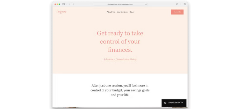
For example, a marketing consultant may lead with “Book a Free Strategy Call,” while a boutique shop highlights “Shop New Arrivals” to drive immediate sales. Identify the one action that best supports your current business goal and make it your homepage priority.
Place Your CTA Where Visitors Can’t Miss It
Even the best CTA fails if visitors never see it. Strategic placement ensures your message stays visible without feeling pushy. The goal is gentle repetition that builds momentum as visitors scroll.
Best practices for CTA placement include:
-
Placing your primary CTA above the fold for instant visibility
-
Using clear, action-oriented language like “Get Started” or “Book Today”
-
Repeating the same CTA mid-page and in the footer for reinforcement
-
Creating visual contrast so buttons stand out from the background
A fitness trainer, for instance, might place “Book Your Free Session” in the hero section, repeat it after testimonials, and include it again near the footer. Review your homepage and make sure your primary CTA appears at least three times.
Use the Right Squarespace CTA Blocks
Squarespace provides flexible CTA blocks that make implementation simple and consistent. Choosing the right block depends on your goal and audience behavior.
Effective CTA block options include:
-
Button blocks for direct actions
-
Form blocks for email sign-ups or inquiries
-
Image blocks with overlay CTAs for promotions
-
Banner section CTAs for launches or offers
-
Newsletter blocks connected to email campaigns
A restaurant may use a banner CTA reading “Reserve Your Table Tonight,” while an online store relies on image overlays with “Shop Now.” Test one CTA block today and adjust its design to increase visibility and clicks.
How Does Your Homepage Reflect Your 2026 Goals? How Your Homepage Should Reflect Your 2026 Business Goals
Align Homepage Content with Strategic Priorities
Your homepage should not exist in a vacuum. It should clearly reflect where your business is headed in 2026 and guide visitors toward that future the moment they land. On Squarespace, homepage sections can be rearranged, updated, and optimized easily, making it the perfect place to reinforce strategic priorities. The key is intentional alignment. When your homepage content mirrors your business goals, every scroll feels purposeful rather than decorative.
Growth - Design for Momentum and Conversion
If growth is a primary goal for 2026, your homepage must actively support revenue and expansion. This often means putting products, offers, or launches front and center. Visual hierarchy matters here. Visitors should immediately see what is new, valuable, or time-sensitive without needing to dig.
Growth-focused homepage elements include:
-
Featured product collections or service highlights
-
“New Arrivals” or launch announcements
-
Limited-time offers with urgency-driven CTAs
-
Clear pathways to checkout or booking pages
A fashion brand, for example, might spotlight its Spring 2026 collection in a hero banner with direct links to shop, while ensuring product images are high-quality and load quickly. Review your homepage and ask if it clearly points visitors toward revenue-driving actions.
Authority - Show Proof, Not Promises
Authority is built through visibility and consistency. A homepage aligned with authority goals positions your brand as knowledgeable and credible before visitors even explore deeper pages. Instead of telling people you are an expert, show them. Featuring thought leadership content directly on the homepage reinforces trust and sets expectations.
Authority-building homepage elements include:
-
A blog or resource feed highlighting recent insights
-
Case studies, whitepapers, or featured research
-
Headlines that emphasize expertise and results
-
Subtle CTAs that invite deeper learning
A consulting firm may highlight recent articles on market trends or strategy insights with a “Read More” prompt, signaling depth and relevance. Add one credibility-focused section to your homepage that clearly demonstrates your expertise.
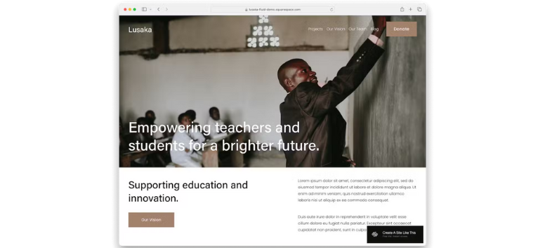
Community - Invite Belonging and Participation
Community-driven goals require a homepage that feels human and inclusive. This priority focuses less on transactions and more on connection. Testimonials, events, and member-focused content help visitors see themselves as part of something larger.
Community-oriented homepage elements include:
-
Upcoming events, webinars, or workshops
-
Membership or program highlights
-
Testimonials and user-generated content
-
Visuals and language that feel authentic and welcoming
A fitness studio, for example, could feature client testimonials alongside a banner promoting its 2026 membership program, creating both trust and excitement. Highlight real voices or experiences on your homepage to strengthen emotional connection.
Keep Your Homepage Updated to Stay Relevant
A homepage should never stay frozen in time. Regular updates help your site stay aligned with changing goals and audience expectations. Seasonal visuals, milestone announcements, and performance-driven adjustments all keep your homepage relevant.
Effective update strategies include:
-
Refreshing banners for seasonal or campaign-based messaging
-
Highlighting achievements like awards or anniversaries
-
Reviewing analytics to see which sections drive engagement
-
Adjusting layout and CTAs based on performance data
Think of your homepage as a living document that evolves alongside your business. Schedule a quarterly homepage review and update it based on current goals and data.
Clarity turns attention into action. By revisiting who you are trying to reach, defining the action you want visitors to take, and aligning your homepage with your 2026 goals, you create a stronger foundation for trust and growth. A focused homepage makes your brand feel reliable. As priorities shift, your homepage should shift too. Take a few minutes to review each section using these three questions, and update your site to reflect where your business is going next.